Redesigning a nonprofit oncology platform for clarity and conversion
A full visual and performance overhaul for Total Health Oncology, the largest provider of free oncology medical education in the U.S.
A mission-driven organization with a website that wasn't keeping up
Total Health Oncology has served the oncology community for over nine years, providing free CME programs and conferences to thousands of healthcare professionals. But their website told a different story.
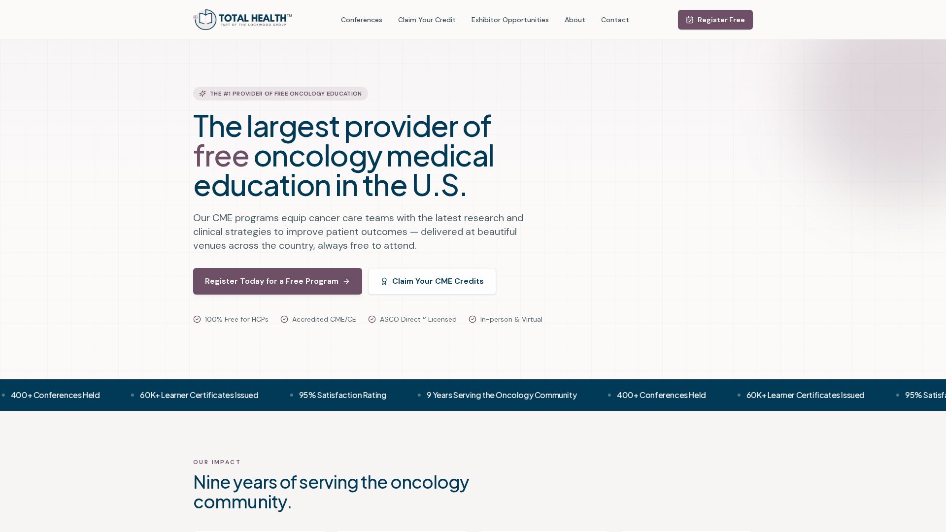
The existing site struggled to communicate the scale and impact of the organization. A text-heavy hero, weak visual hierarchy, and slow load times meant that physicians and patients alike were bouncing before they understood the full value of what was offered. The organization needed a digital presence as strong as its mission.
- Text-heavy hero section with no clear primary action
- No visual social proof. 9 years and 60,000+ attendees were buried in copy
- Muted color palette and inconsistent typographic scale
- Conference cards lacked clarity. Dates, locations, CME credits hard to scan
- Poor PageSpeed scores hurting SEO and mobile experience
- No clear dual-audience design (physicians vs. patients)
The transformation, side-by-side
Drag the slider to compare the original site with the redesigned version.
Drag handle to compare · Click anywhere to jump
What changed, and why it matters
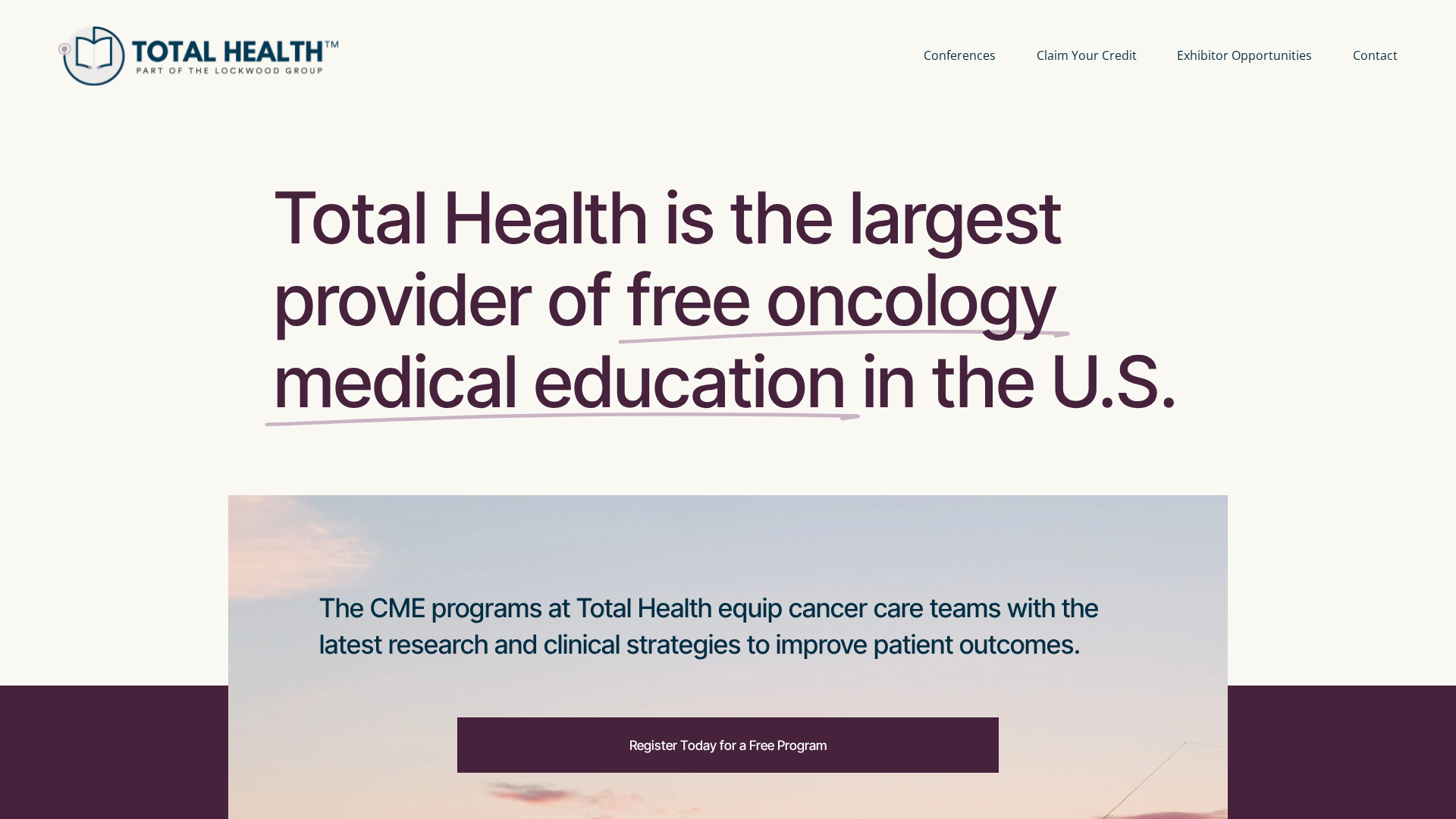
- –Text-heavy hero with no focal point
- –Limited visual hierarchy across the page
- –Muted color palette lacked urgency
- –No prominent social proof or trust signals
- –Basic conference listing. Hard to scan
- –Minimal imagery; text-dominant layout
- –No dual CTA for physicians vs. patients
- +Clean hero with focused messaging and strong headline
- +Clear typographic scale. F-pattern reading flow
- +Refined navy and burgundy palette, purposefully used
- +Stats bar front-and-center: 9 years, 400+ programs, 60k+ attendees
- +Scannable conference cards with date, location, CME badges
- +Full-bleed imagery and white space to breathe
- +Dual CTAs: Register and Claim CME Credit
Every section, deliberately redesigned
From the hero through to the footer, each section was rethought. Not just visually, but structurally, to serve a specific audience goal.
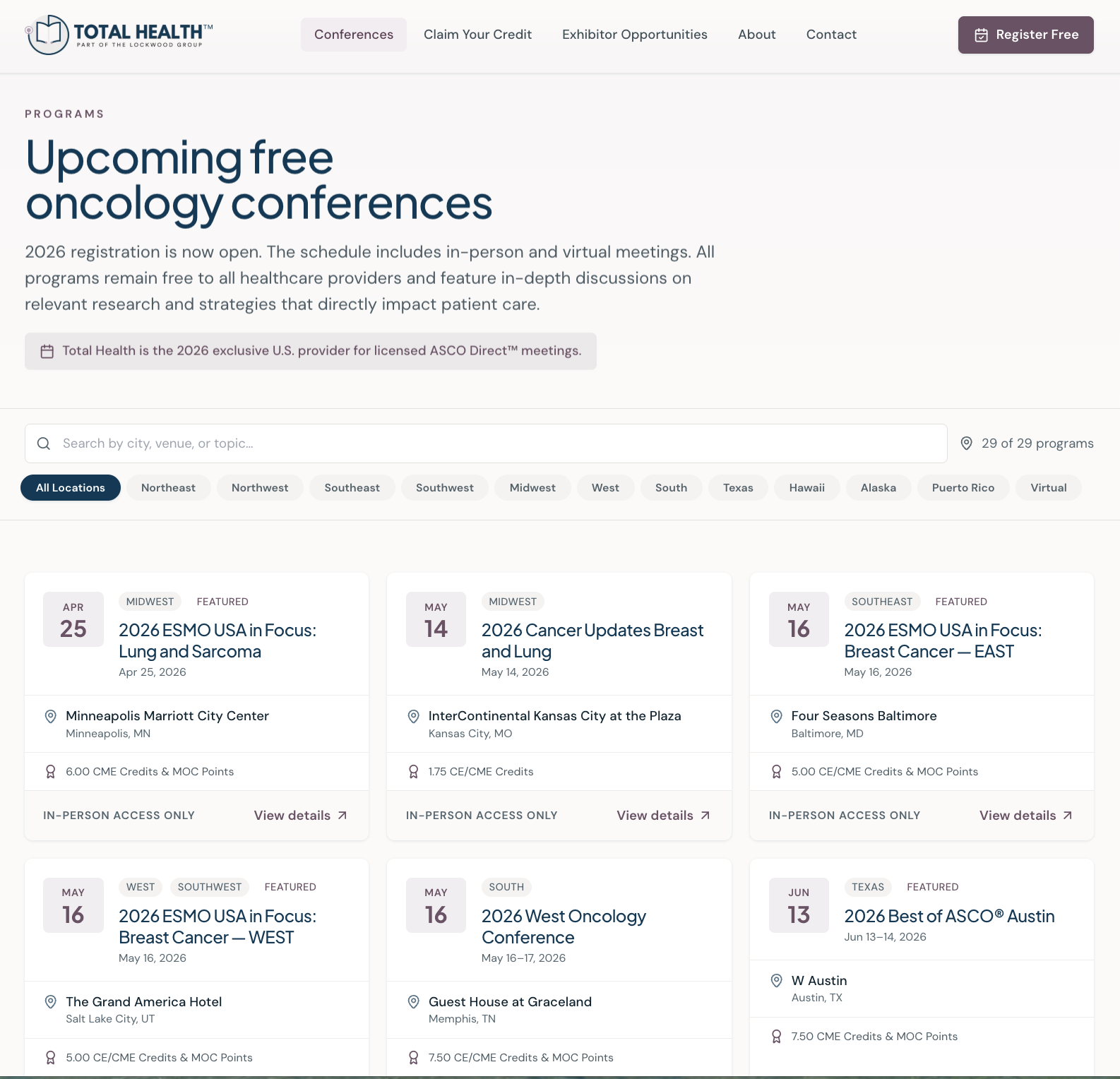
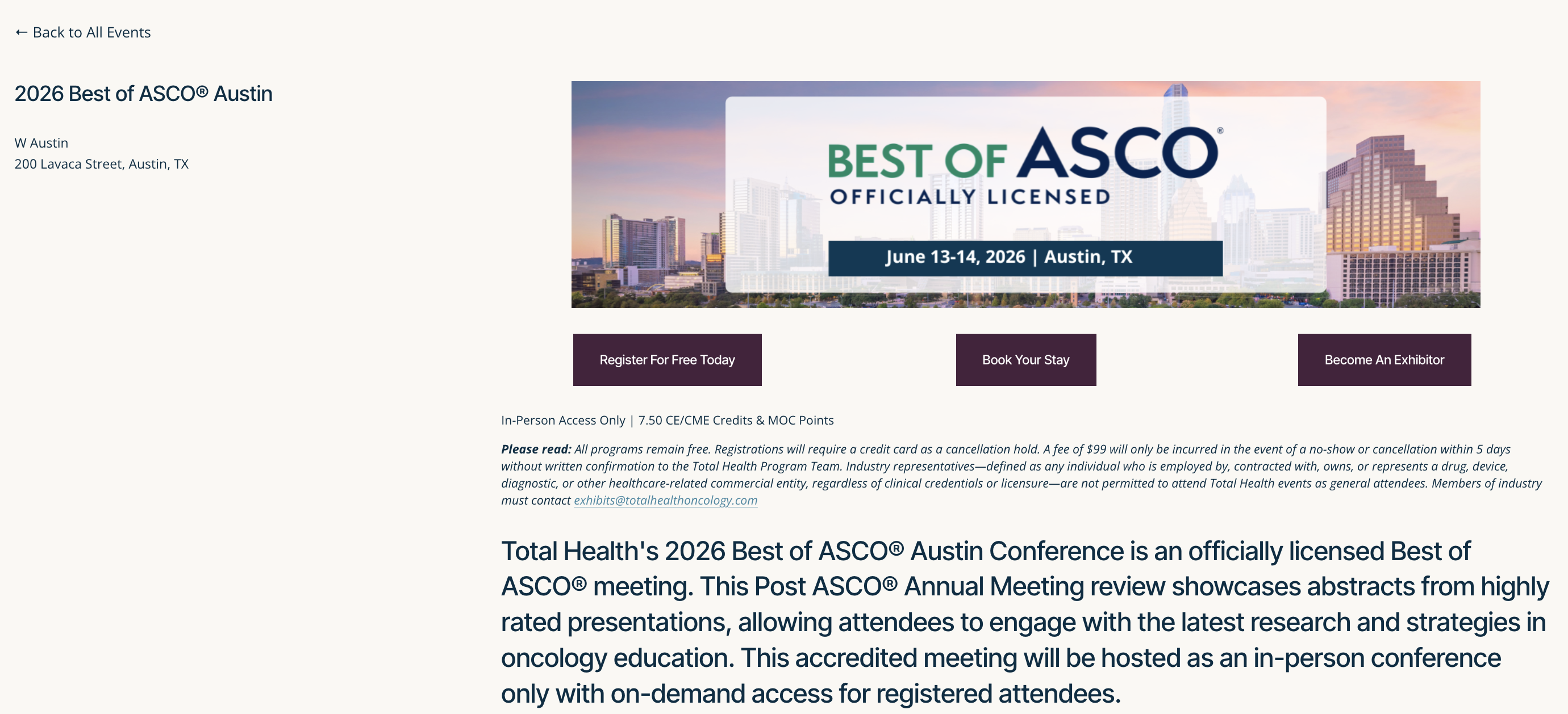
Conference cards that actually convert
The old listing relied on a dated list-table layout that buried key information. The redesign introduces scannable cards with city photography, date badges, CME credit tags, and clear 'View details' links, making it fast for physicians to find and register for programs near them.
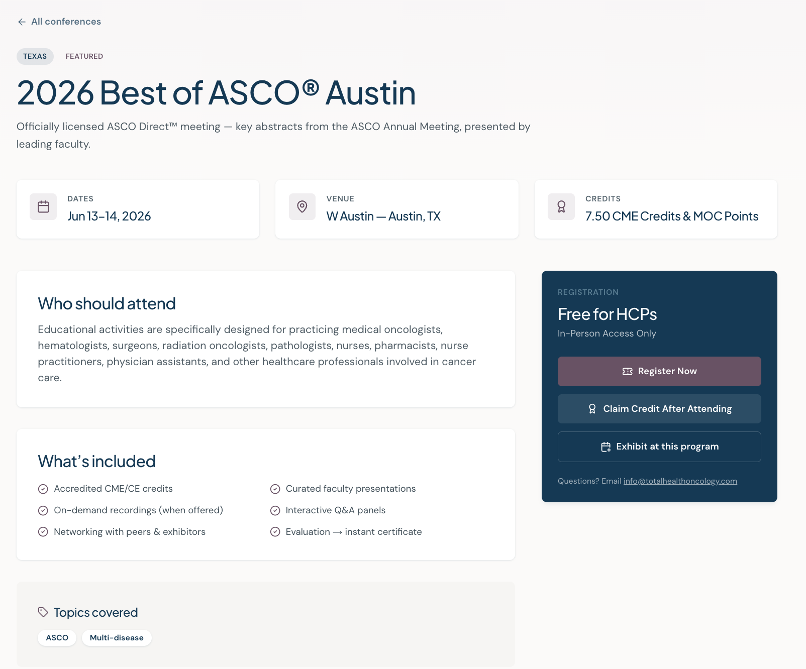
From a basic event listing to a full registration experience
The old conference detail page was a bare-bones layout, a title, a photo, two buttons, and a wall of fine print. The redesign gives each conference its own structured experience: date/venue/credits info cards, a clear audience statement, a what's included checklist, topic tags, and a persistent registration sidebar with three distinct CTAs. Physicians get everything they need to commit without hunting for details.
PageSpeed improvements
Beyond the visual refresh, the redesign included a full performance audit. Faster pages mean better SEO, lower bounce rates, and a smoother experience for oncology professionals accessing the site on mobile between patient consults.
“The new site finally reflects the quality of what we do. Our registration numbers improved within the first month, and we are consistently hearing from attendees that the experience feels more professional and trustworthy.”
Ready to transform your website?
We design and build fast, purposeful websites for organizations that want their digital presence to match the quality of their work.