
Rebuilding a union local's website into a member-first digital hall
A full website migration for IBEW Local Union 113 in Colorado Springs — replacing an aging, WordPress-era site with a modern, mobile-first platform anchored by an all-day job dispatch board that keeps members working and makes the local look as professional as the trade it represents.
A respected local held back by an outdated website
IBEW Local Union 113 has represented the electrical workers of Colorado Springs and the Pikes Peak region for over 125 years. But the website members and prospects saw first did not reflect that legacy — or the professionalism of the local behind it.
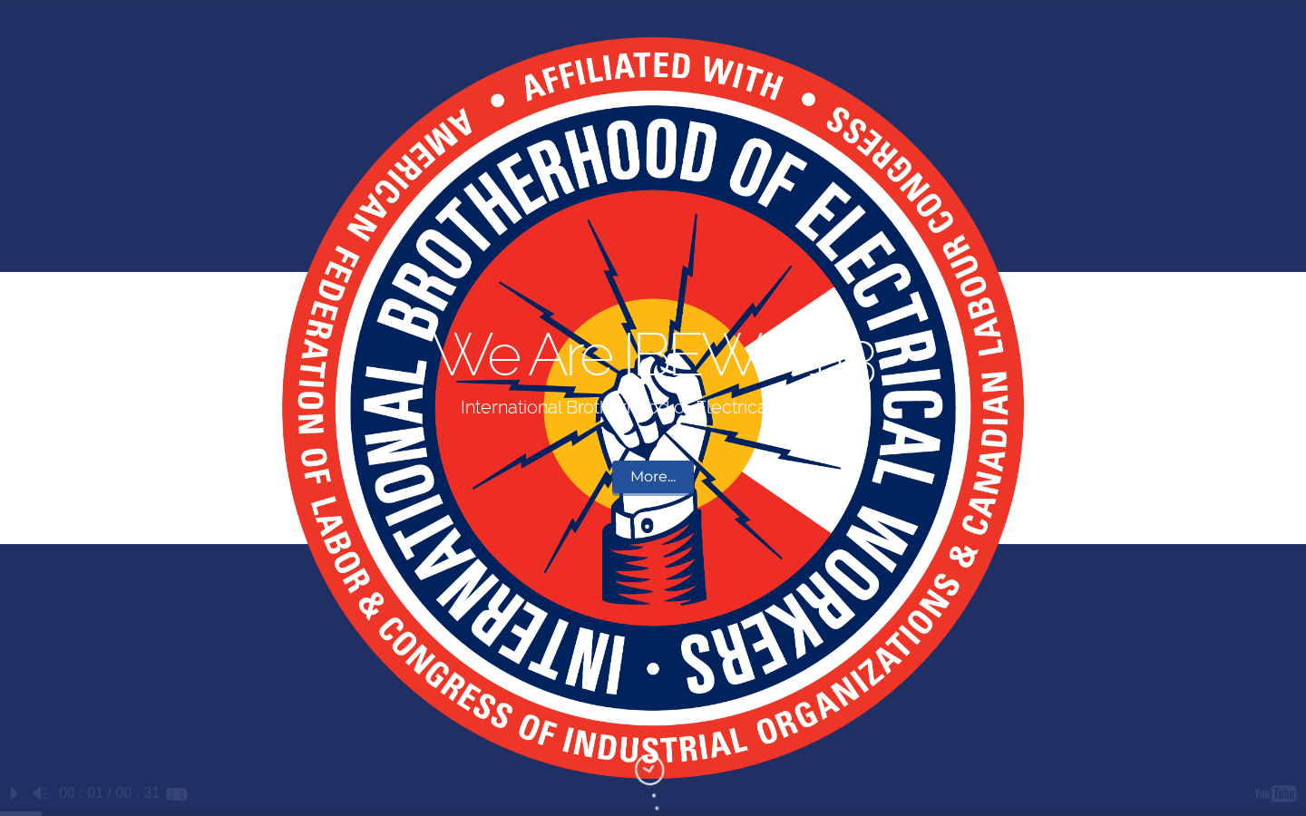
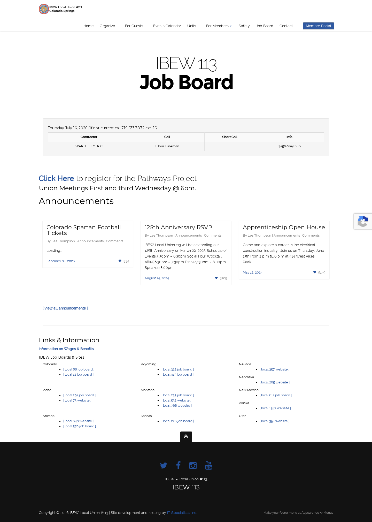
The old site was a dated WordPress build that opened with a spinning union emblem and no clear message about who the local served or what to do next. A nine-item menu buried the pages that mattered. The job board — arguably the most-used page on any union site — was a single bare HTML table that showed one job call at a time. The page for prospective electricians was a wall of text ending in a fax number and a broken email icon. And in the footer, an unedited WordPress placeholder — "Make your footer menu at Appearance >> Menus" — was visible to every visitor. For a local whose members wire the region's homes, hospitals, and job sites, the website undersold everything they stood for. For any local weighing a rebuild, the stakes are the same: the website is where members go to find work, where contractors size up the local, and where the next generation of electricians decides whether to join.
- Homepage led with a spinning union emblem and no value proposition — visitors never learned who the local served or what to do next
- A sprawling nine-item navigation buried the pages members actually used
- The job board was a single bare HTML table that showed just one job call at a time
- An announcements card was stuck on "Loading…" — broken dynamic content shown to the public
- The join page for prospective electricians was a wall of text ending in a fax number and a broken email icon
- Live WordPress placeholder text ("Make your footer menu at Appearance >> Menus") was visible in the footer to every visitor
- Not built mobile-first — the hero logo clipped and a reCAPTCHA badge overlapped the job table on phones
- Inconsistent typography and colors with almost no photography — nothing that signaled a professional, modern local
The transformation, side-by-side
Drag the slider to compare the original site with the redesigned version.
Drag handle to compare · Click anywhere to jump
From dated WordPress site to modern union platform
- –Spinning emblem hero with no headline, message, or clear call to action
- –Nine-item menu that buried dispatch, join, and member resources
- –Job board was one plain table row — no classifications, no job detail
- –Prospective-member page was a text wall with a fax number and broken email icon
- –No member self-service — routine questions meant a phone call to the hall
- –WordPress placeholder text and broken widgets left visible to the public
- –Thin, duplicated content that made the local hard to find and navigate
- –Not mobile-first — clipped logo and reCAPTCHA overlapping content on phones
- –Mixed fonts and colors, almost no photography
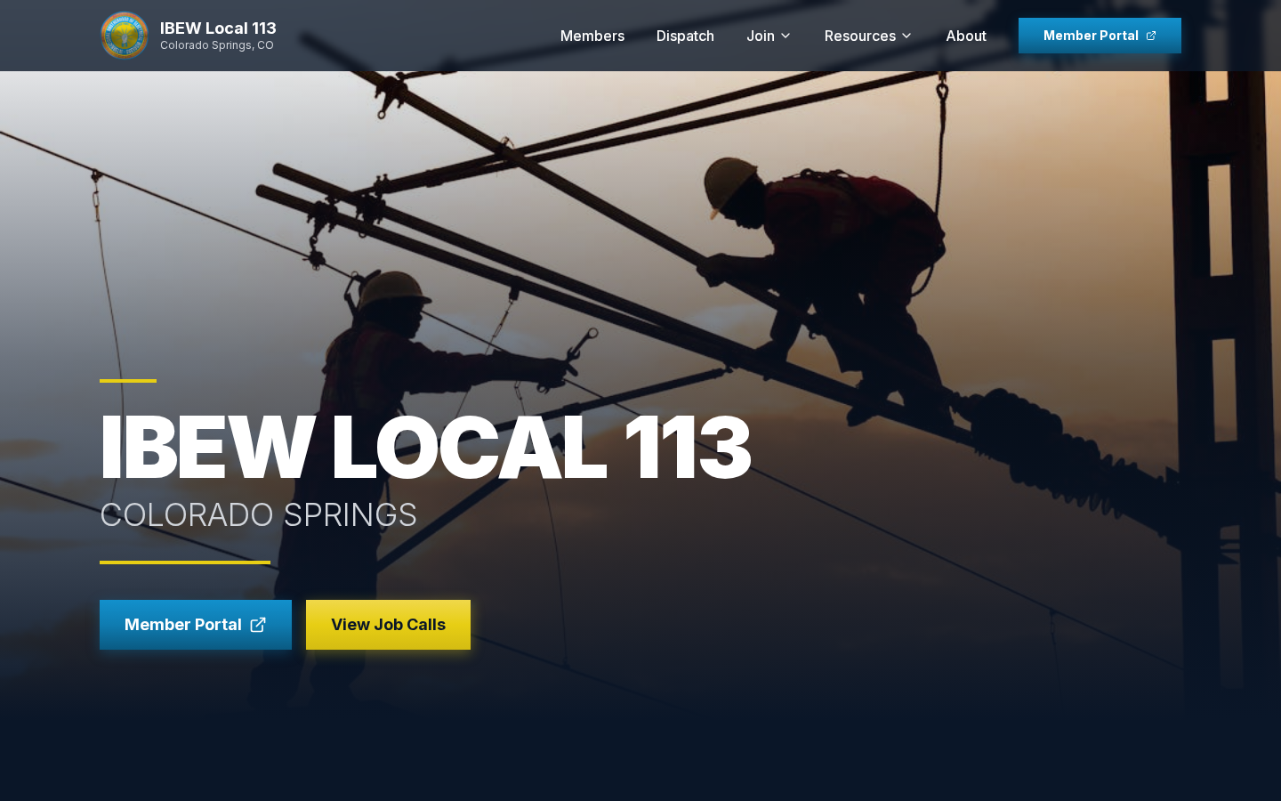
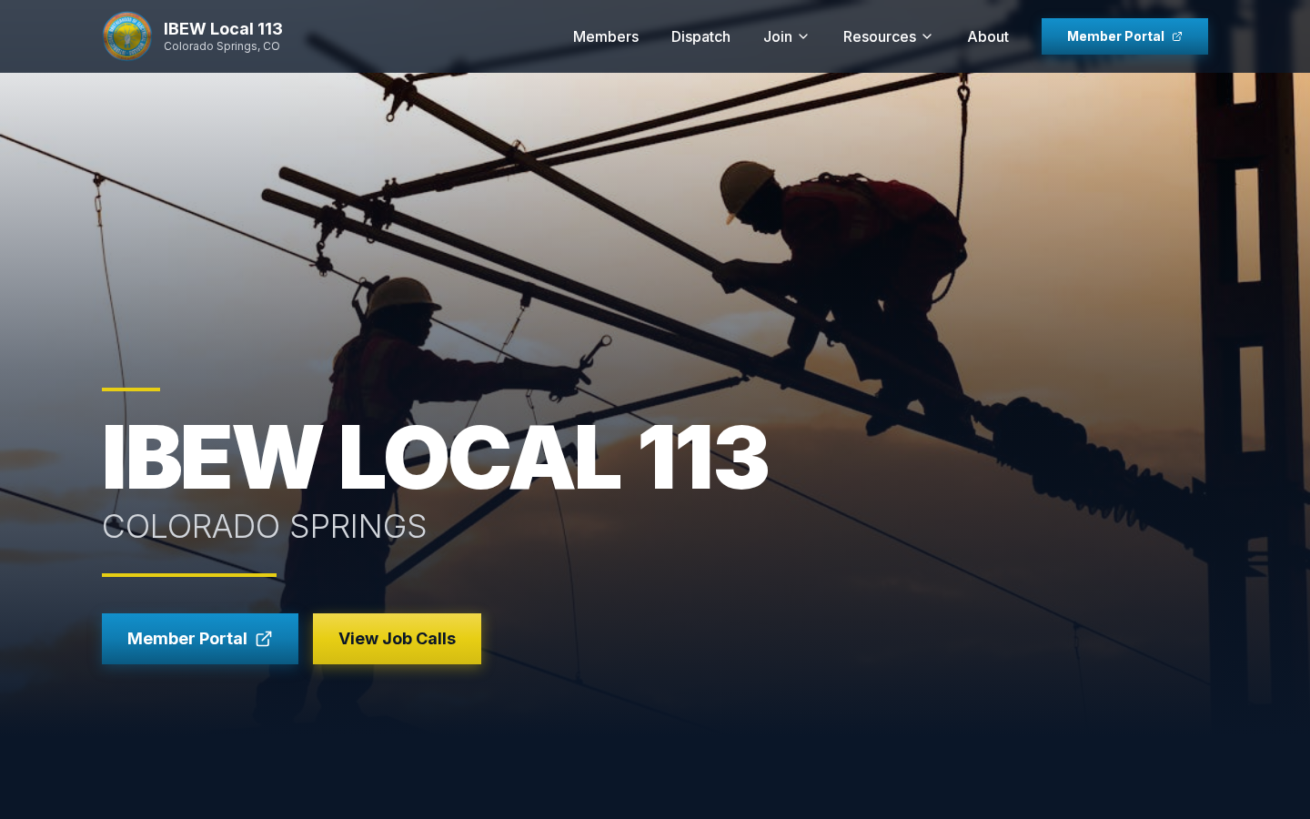
- +Photography-led hero with a clear headline, location, and instant Member Portal + View Job Calls actions
- +Focused navigation — Members, Dispatch, Join, Resources, About
- +All-day Job Dispatch organized by classification with full call detail (wage, location, agreement, start date)
- +A guided "Join as an Electrician" funnel that captures prospects and routes them by trade
- +A Member Portal link in the header and hero — dues, benefits, and account access one tap away
- +A professional presence that helps the local attract signatory contractors and community partners
- +Mobile-first layout members can use straight from the job site
- +Built to be found — clean structure and real content so members reach the local through search
- +Professional footer with contact, office hours, and heritage (Est. 1901) — no placeholder text
- +Consistent IBEW branding, real member photography, and a clear content hierarchy
Every section, deliberately redesigned
From the hero through to the footer, each section was rethought. Not just visually, but structurally, to serve a specific audience goal.
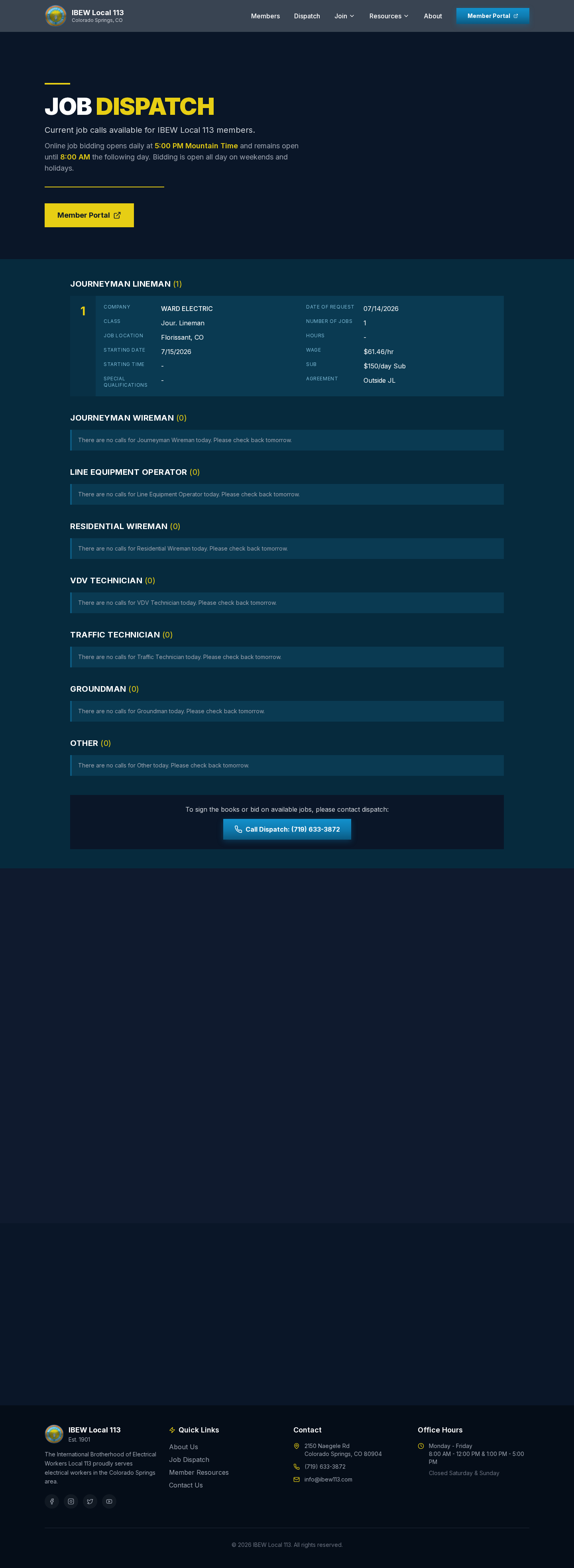
From a one-line job table to an all-day dispatch board
The old job board was a single HTML table that showed one call at a time, with a reCAPTCHA badge overlapping the header on mobile. The rebuilt Job Dispatch page organizes calls by classification — Journeyman Lineman, Journeyman Wireman, Line Equipment Operator, Residential Wireman, VDV Technician, Traffic Technician, Groundman, and more — and every call shows the detail a member needs to bid: contractor, job location, start date, hours, wage, sub rate, and agreement type. It states the daily bidding window up front (open from 5:00 PM until 8:00 AM, and all day on weekends and holidays), and empty classifications clearly say to check back tomorrow. The board works around the clock, so members can see real, current work from their phones instead of calling the hall. For the local, that means fewer routine calls to field and a dispatch process that finally looks as organized as it already is.
Built for the phone in every member's pocket
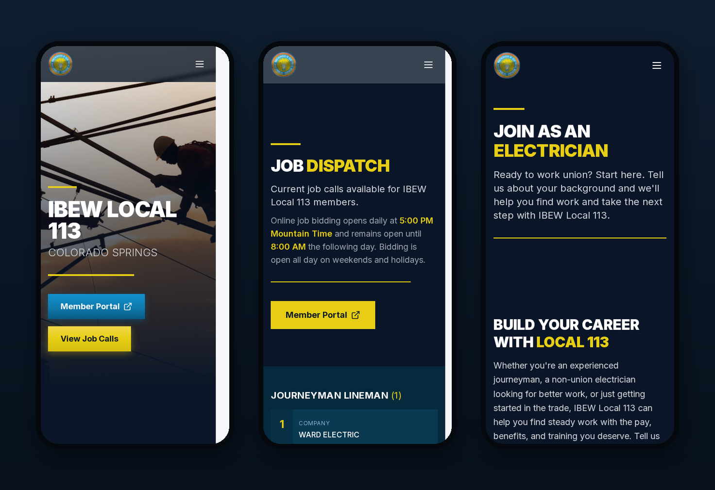
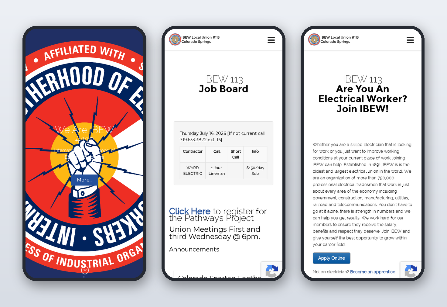
Most members check dispatch and bid on calls from their phones — often standing on a job site, not sitting at a desk. The old site was never built for that: the union emblem swallowed the entire first screen, the job table was pinched into an unreadable sliver with a reCAPTCHA badge floating over it, and the join page ran on as an endless column of text. The rebuilt site is mobile-first from the ground up. The hero, the dispatch board, and the join funnel are all laid out for a thumb — large tap targets, readable type, and no overlapping controls — so a member can check work, place a bid, or reach the hall in seconds. For most locals the majority of website traffic comes from phones, so a site that works on mobile is not a nice-to-have; it is the site members actually use.
A join page that actually recruits
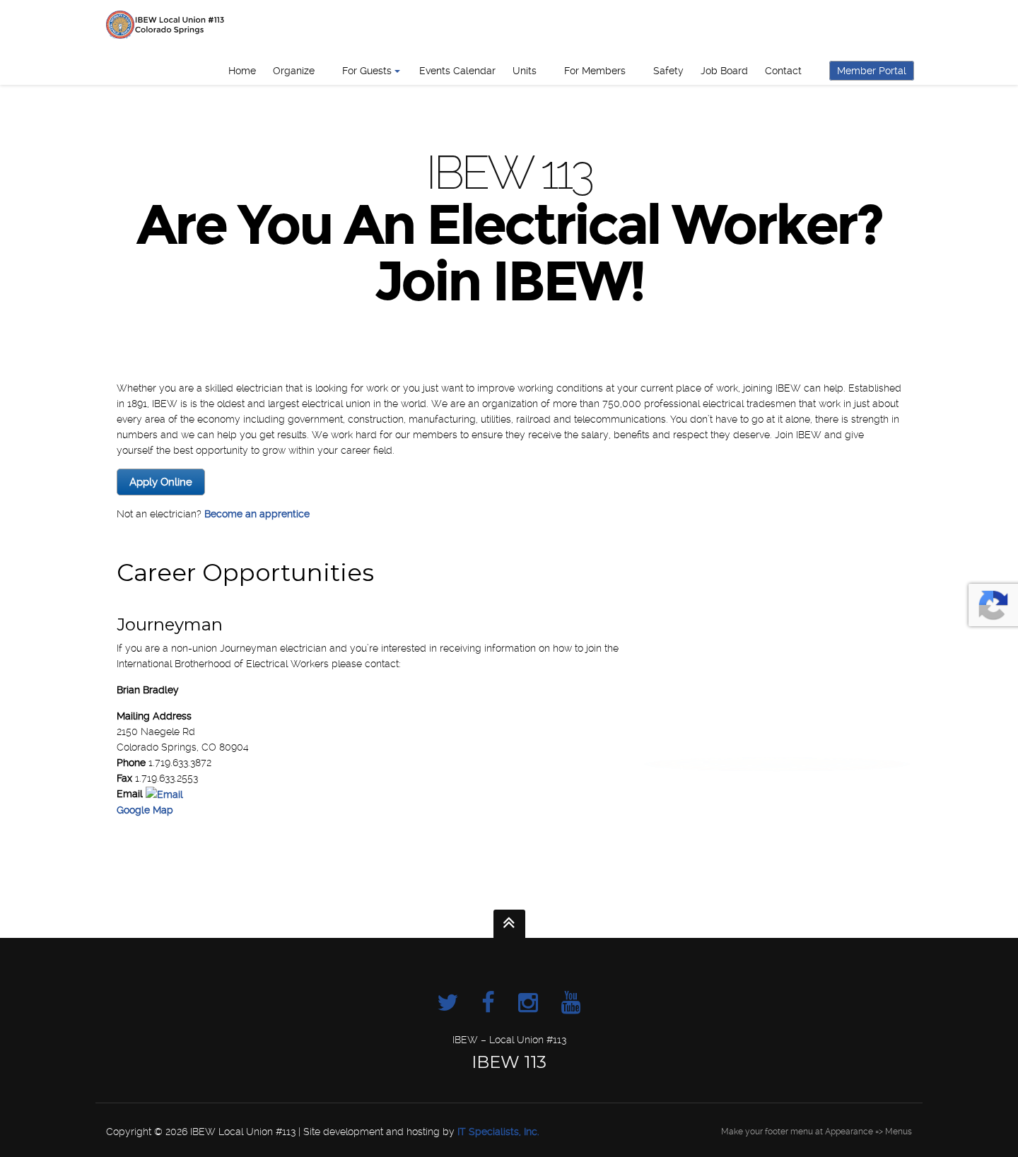
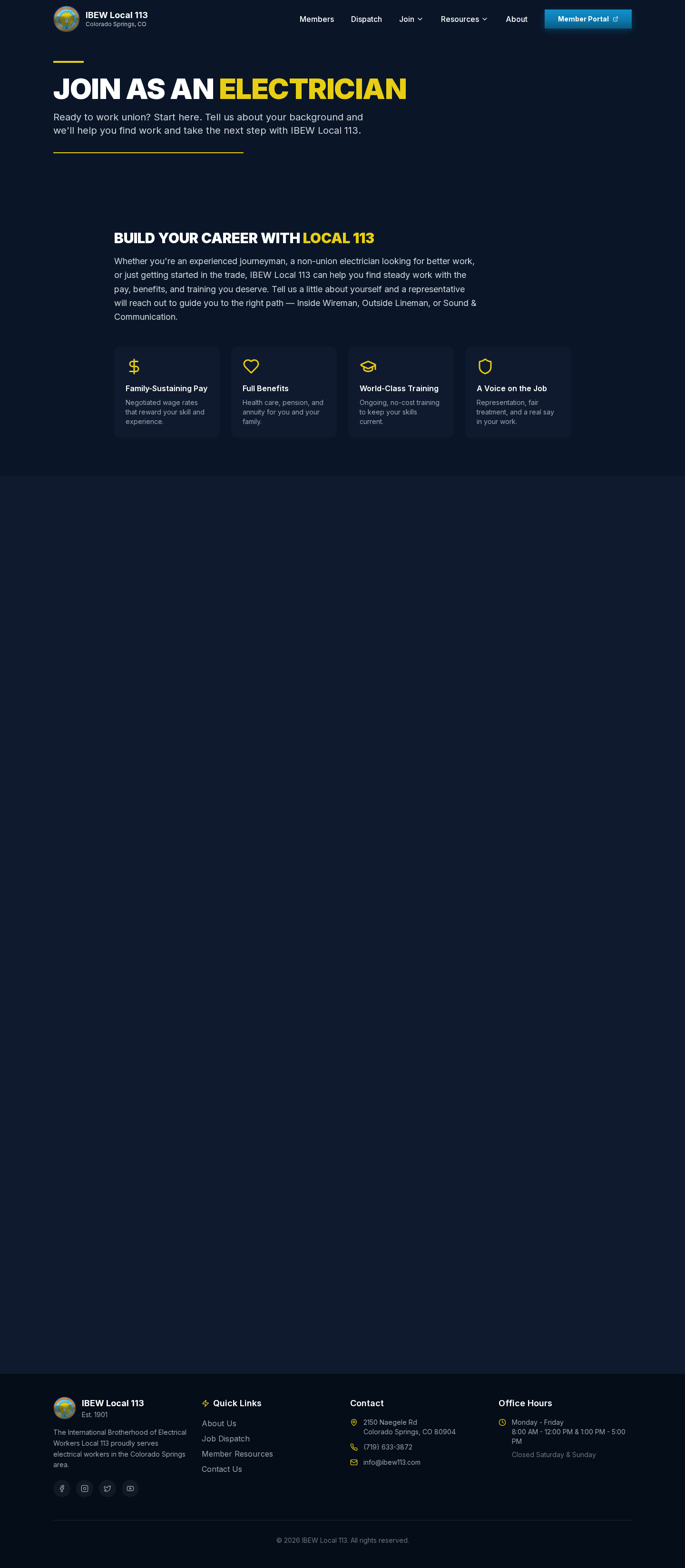
Recruiting new members is core to every local's future, but the old "Are You An Electrical Worker?" page was a paragraph of history that ended in a fax number and a broken email icon. The new "Join as an Electrician" page leads with the reasons to go union — family-sustaining pay, full benefits, world-class training, and a real voice on the job — then invites prospects to share their background so a representative can route them to the right path: Inside Wireman, Outside Lineman, or Sound & Communication. It turns a dead-end page into a genuine intake funnel that supports the local's organizing goals — and, paired with a clear message to contractors and community partners, it helps the local grow both its membership and its signatory work.
Ready to transform your website?
We design and build fast, purposeful websites for organizations that want their digital presence to match the quality of their work.